In Summer 2025, I joined EdisonOS as a Lead Product Designer on a 3-month consulting engagement.
The goal: help lay the foundation for their new B2B2C SaaS product — built for test prep academies, tutors, and students.
My responsibilities included:
Designing the application modal and mapping key user flows
Creating the first version of the design system — including components, grids, and typography
Providing design strategy, UX consultation, and UI guidance across the product
Working closely with PMs, engineers, and stakeholders to ensure alignment at every step
The focus was not just to design screens, but to create a system the entire team could build on.
Lead Product Designer
Duration
Apr 2025 - Jun 2025
Web
B2B2C SaaS
EdisonOS is a test-prep platform designed for academies helping students prepare for exams like SAT, ACT, AP, and PSAT. When I joined, the team was gearing up to rebuild the product from scratch.
I started by connecting with stakeholders, listening to customer calls, and reviewing how the platform was being used. This gave me clarity on who the users were, what they needed, and where the current experience was falling short.
The existing product had grown through feature requests over time — resulting in a cluttered experience. Many features went unused, and users struggled to find what they needed. There was no clear system or structure tying things together.
Key user flows were fragmented.
The visual language was inconsistent.
There was no design system in place, and development lacked structure
Align the team on a shared vision
Create scalable systems and user flows
Set a strong design foundation for the new product
Laying the foundation
I followed a Design Thinking approach to guide the strategy and problem-solving process — from understanding users and defining core objects, to ideating flows and iterating based on feedback.
The execution was grounded in Lean UX principles — fast cycles, tight collaboration, and shared understanding over heavy documentation.

With product context in place, I needed to align everyone on what we were building — and why.
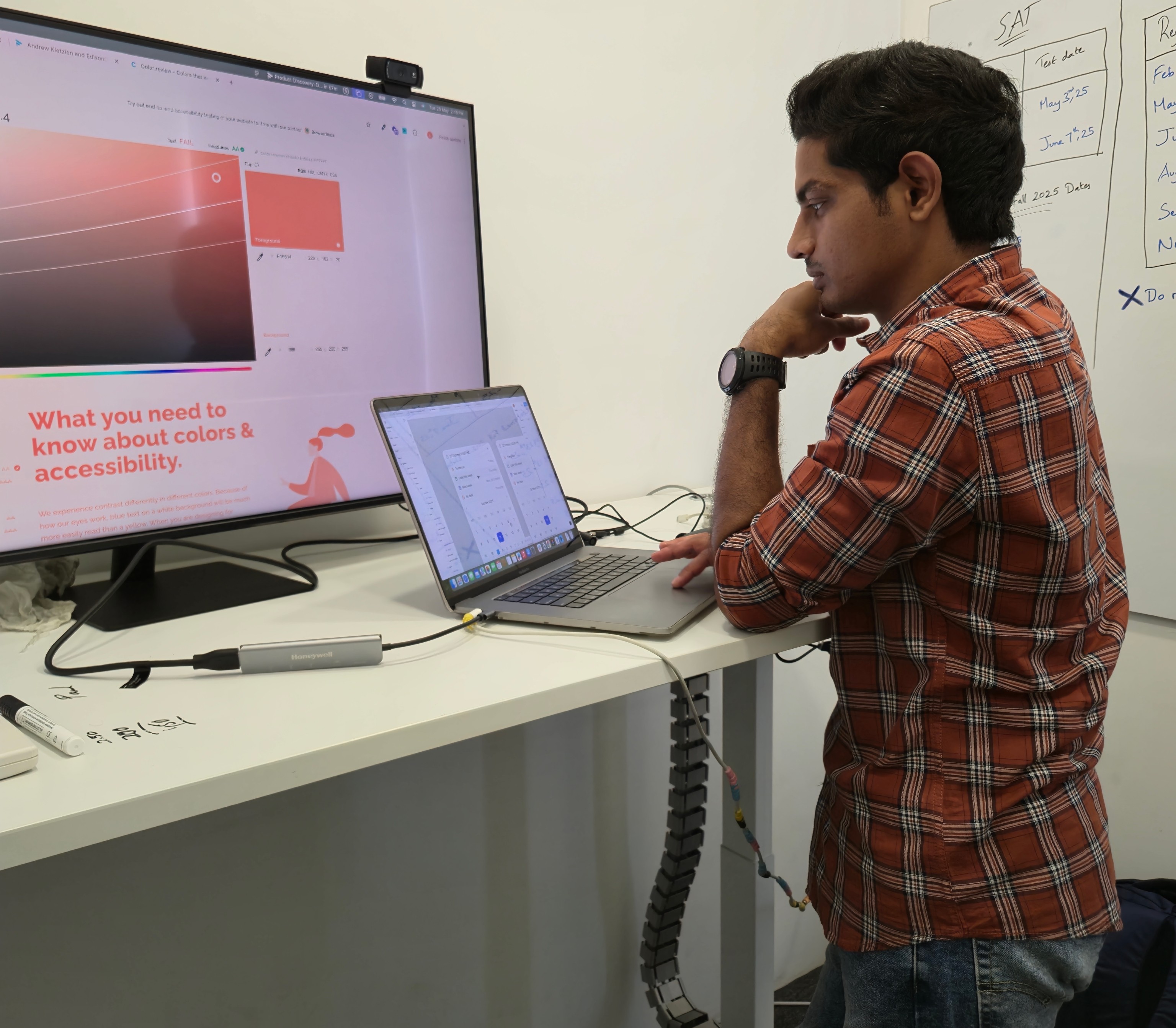
I started by gathering the team into a shared FigJam board. Each person dropped insights, pain points, and ideas from their function — product, engineering, support, sales. This ensured we weren’t designing in a vacuum.
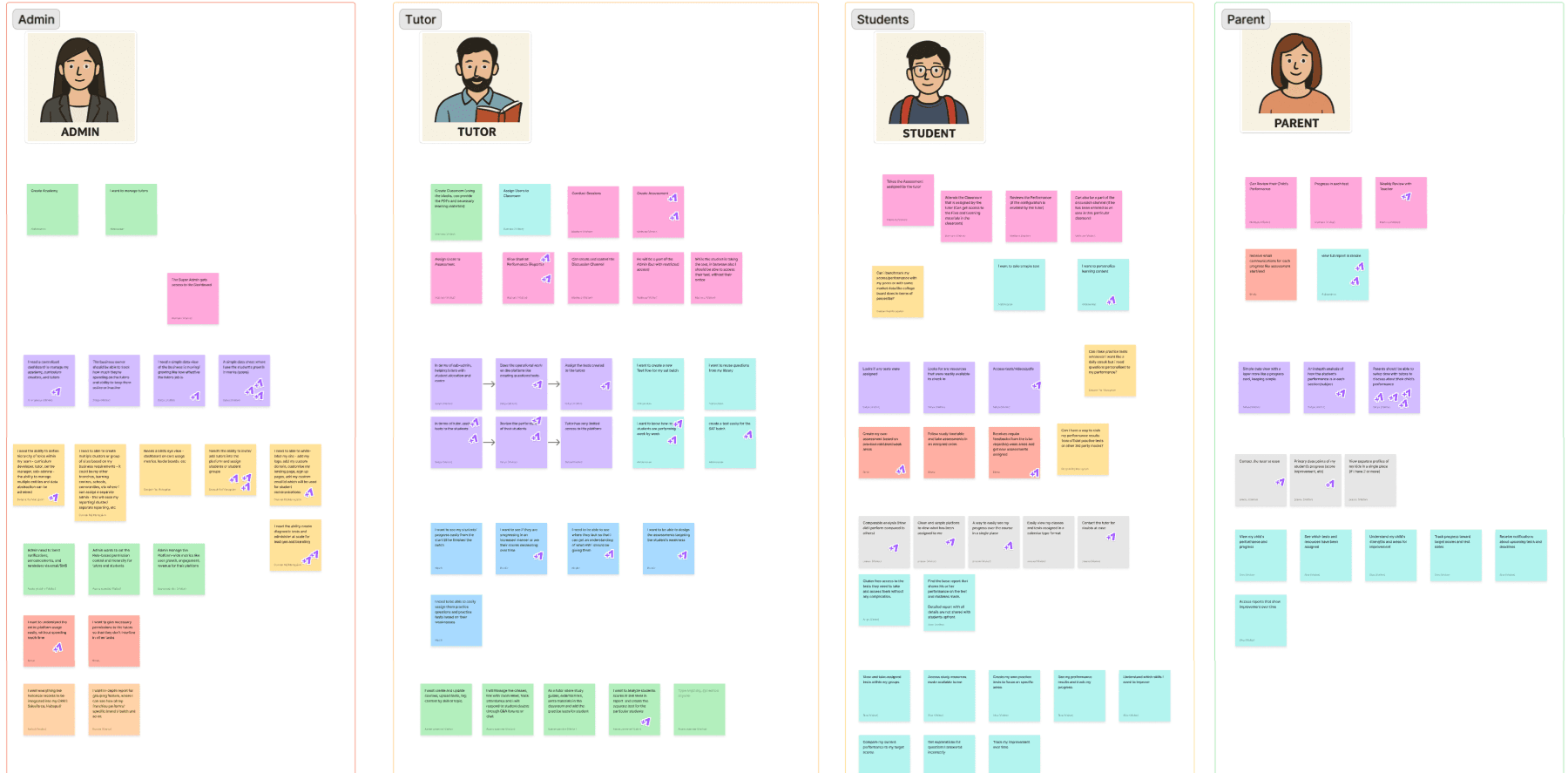
Once I had everyone's input, I started defining the core objects of the product — the essential building blocks that power how users interact with the platform.
Before jumping into structure, I mapped the core objects users interact with every day — like:
Programs (test prep content, eg: SAT, ACT, etc.)
Students (profiles, reports)
Tests (scheduled, practice)
Tutors and Admins (roles, actions)
For each object, I defined
With these building blocks in place, I created the application modal — a high-level blueprint of the product. It clarified:
Object relationships
Role-based actions
Where each user flow fits
This wasn’t a one-and-done. The modal went through multiple iterations with the team — and became our north star for both design and development.
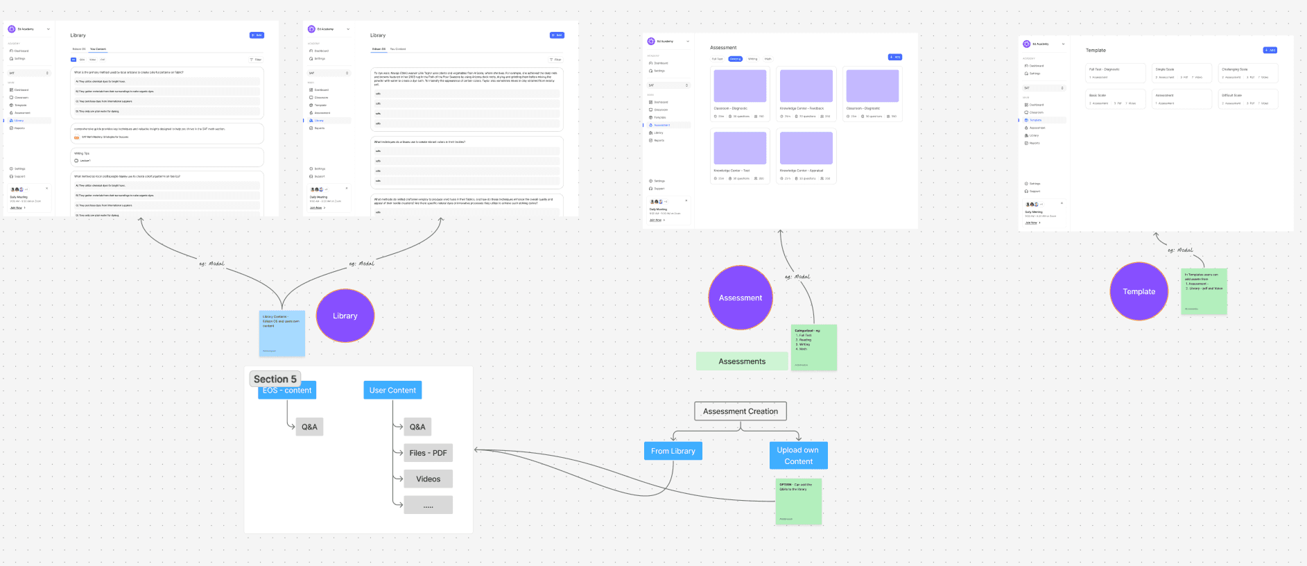
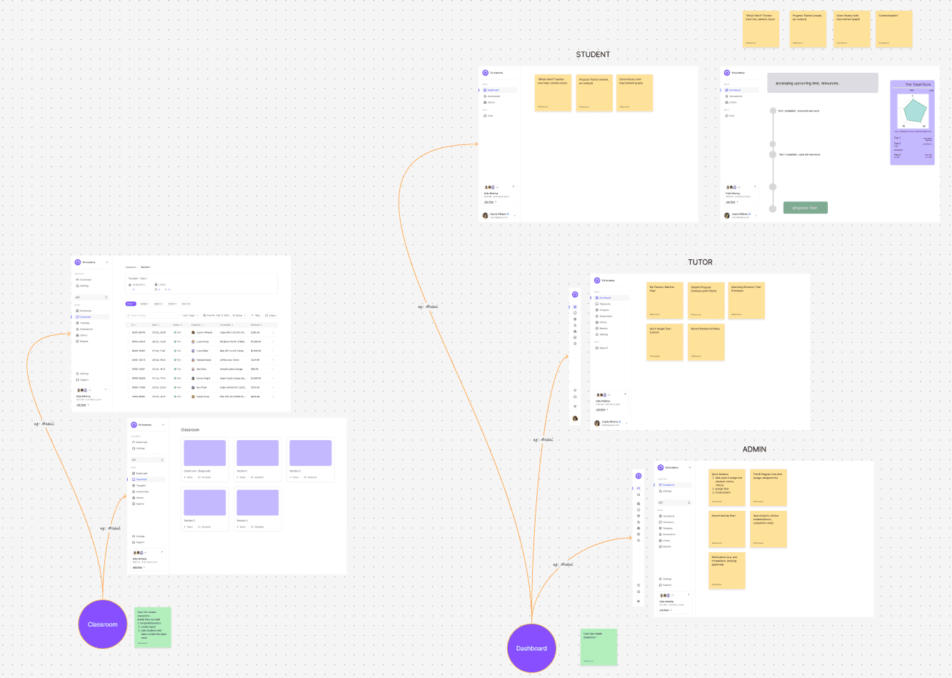
This helped everyone see the product the same way.
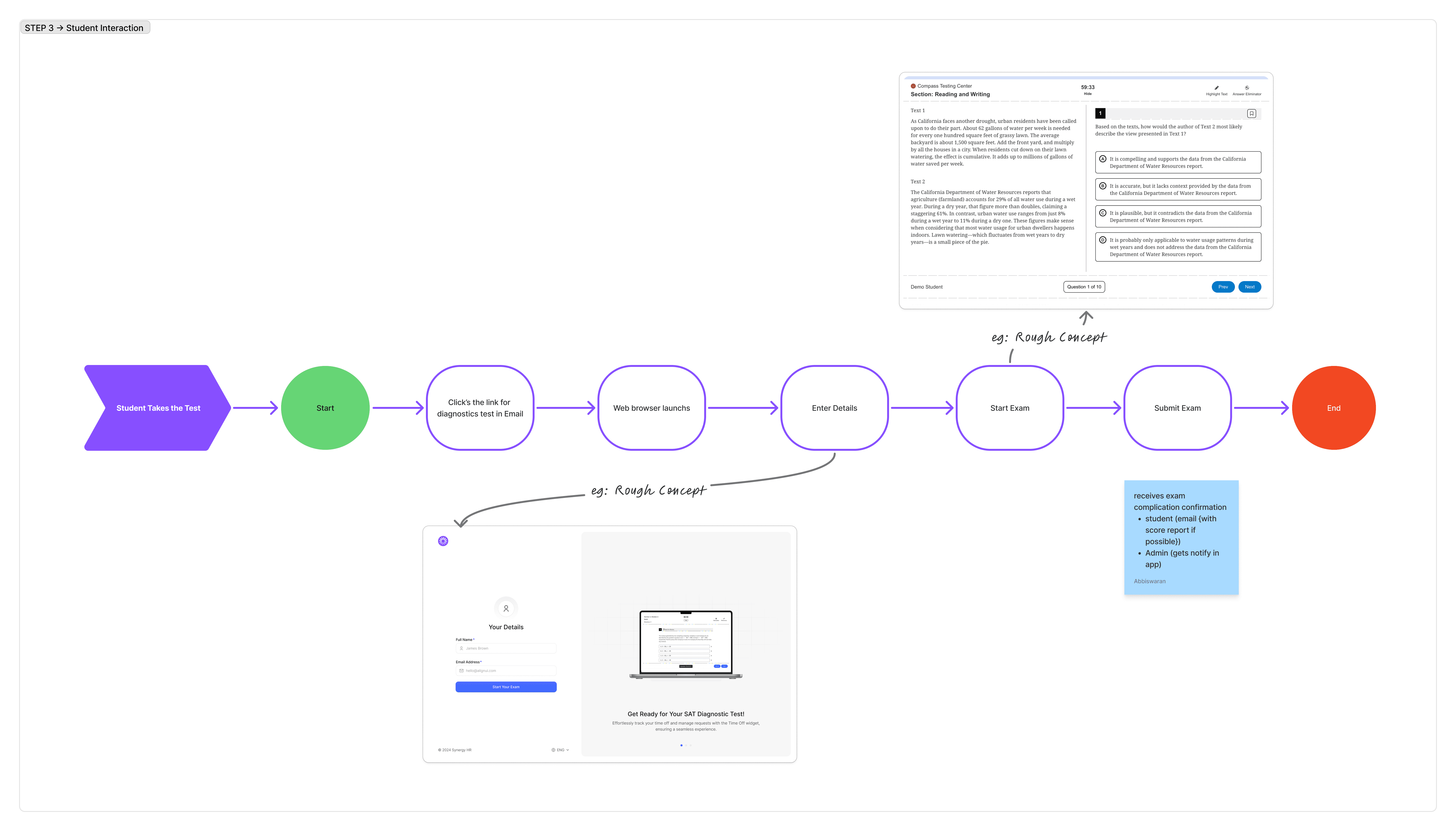
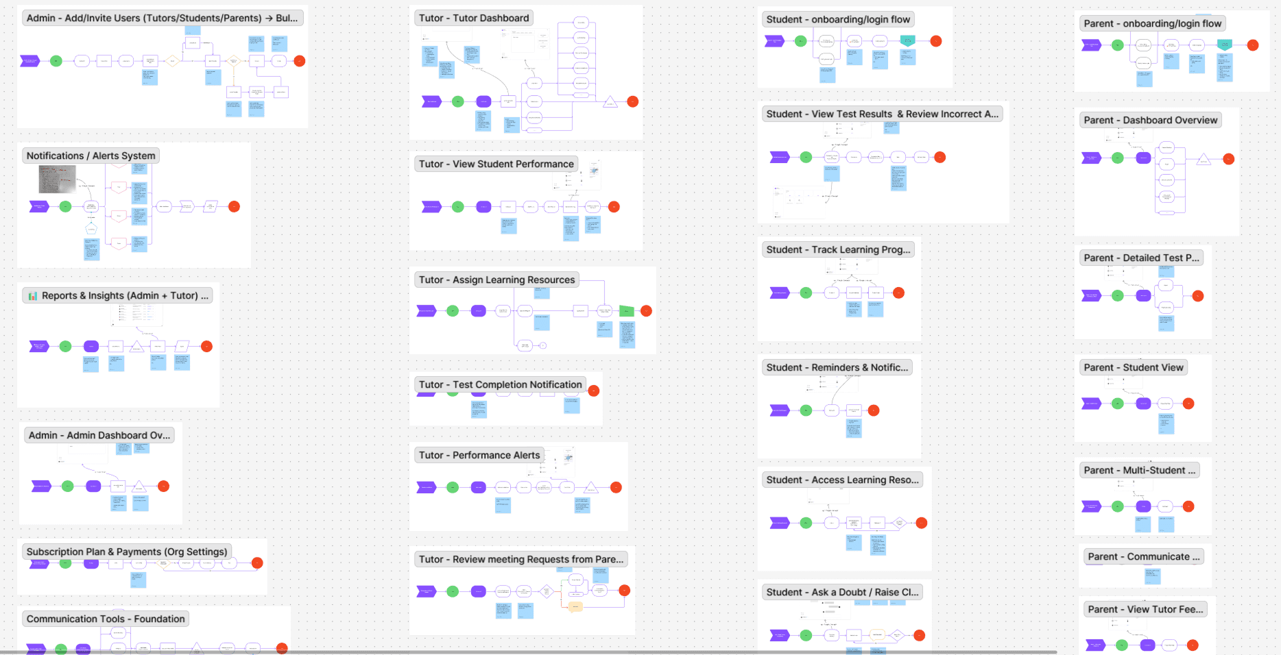
Then, I mapped key user flows — especially for Admins, Tutors, and Students — and shared them for alignment.
With the application structure in place, I drafted a list of all major user flows — across Admin, Tutor, and Student roles — and organized them in a shared Google Sheet.
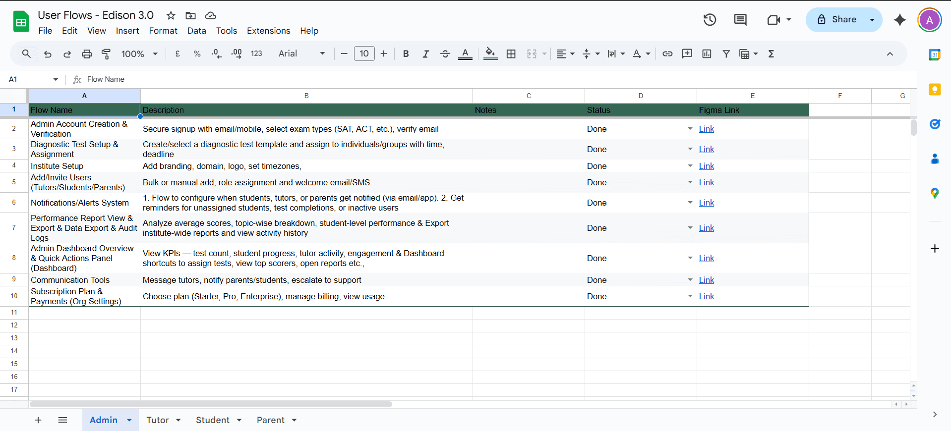
From there, I prioritized flows based on business needs, user impact, and technical feasibility.
Instead of tackling everything at once, I worked in focused phases:
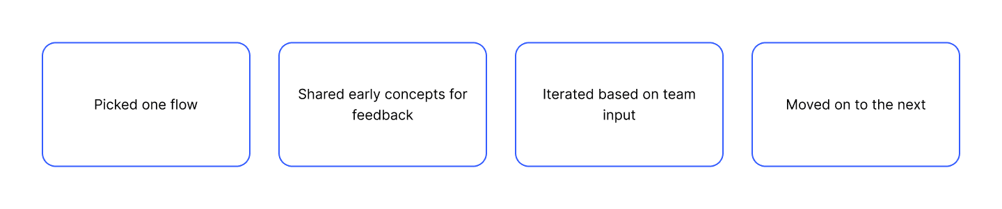
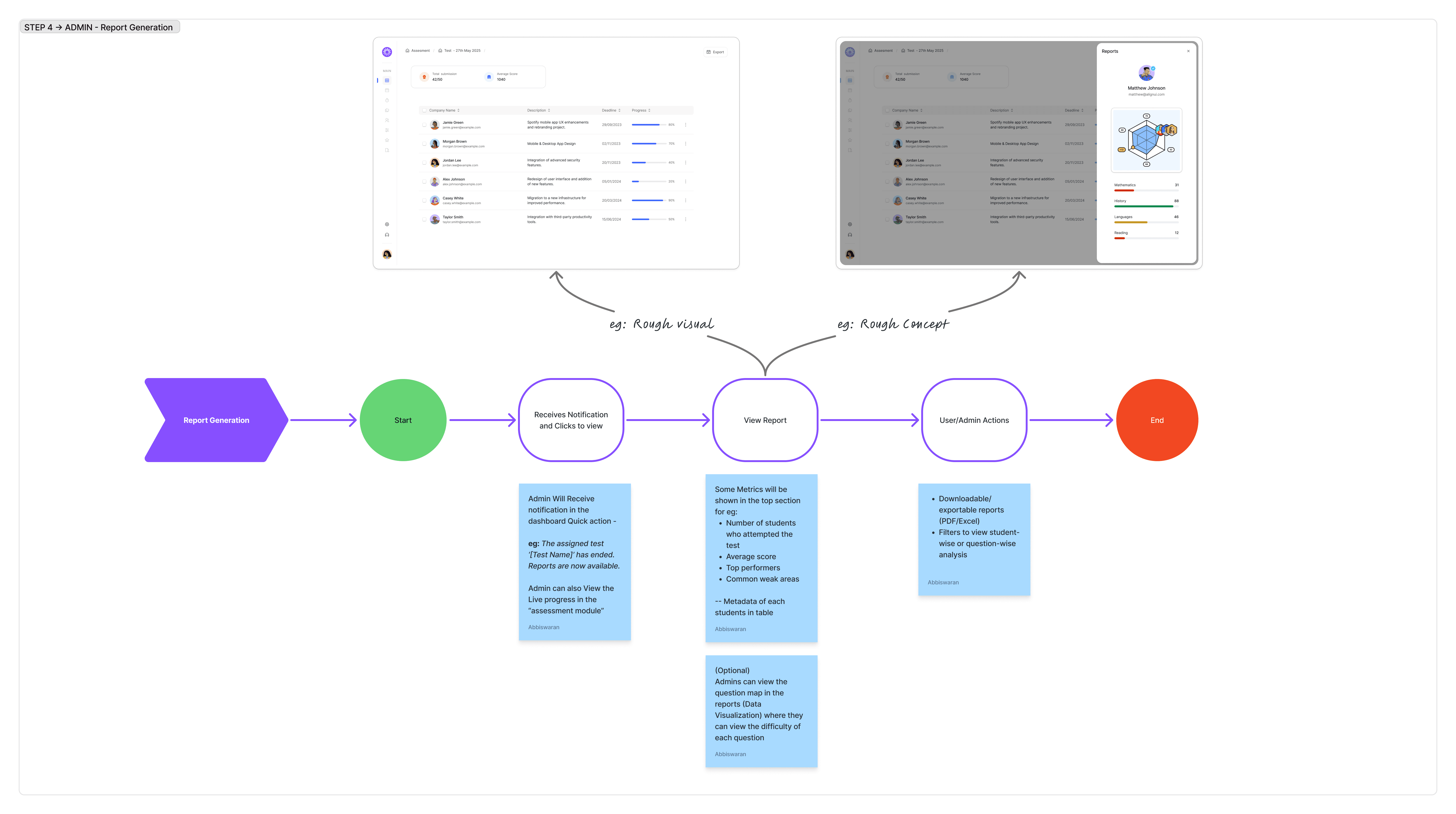
While one flow was in review, I’d begin exploring the next — keeping momentum across parallel tracks without compromising feedback loops.
This phased approach helped the team stay aligned, reduced rework, and ensured each user journey was shaped with intention.
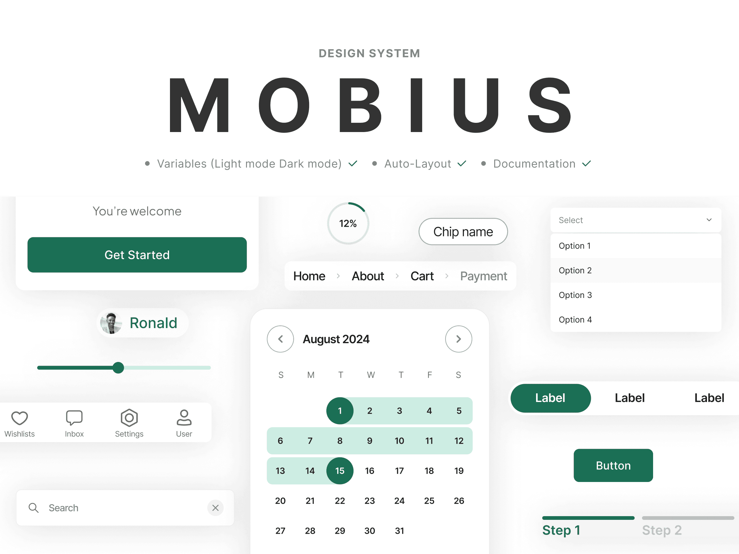
As user flows took shape, I began building the design system using principles of Atomic Design — starting from foundational tokens and moving up to fully reusable components.
The system included:
Color styles, typography scales, spacing, and grids
Basic elements like buttons, inputs, and icons
Composite components like modals, tables, and cards


Everything was documented in Figma with clear usage rules. I collaborated with developers to ensure smooth implementation and consistent behavior across the app.
This helped:
Speed up the design-to-dev process
Maintain a unified visual language
Reduce design debt from the start
The design system became more than a library — it became a shared language for the team.
Clarity early on saves time later. Getting alignment before screens made every next step smoother.
Good systems outlive features. The design system is now a reference point — not just a UI kit.
Design is a team sport. The best ideas came from conversations, not just Figma.
This project is protected by a Confidentiality Agreement, please contact me for additional information related to it.